
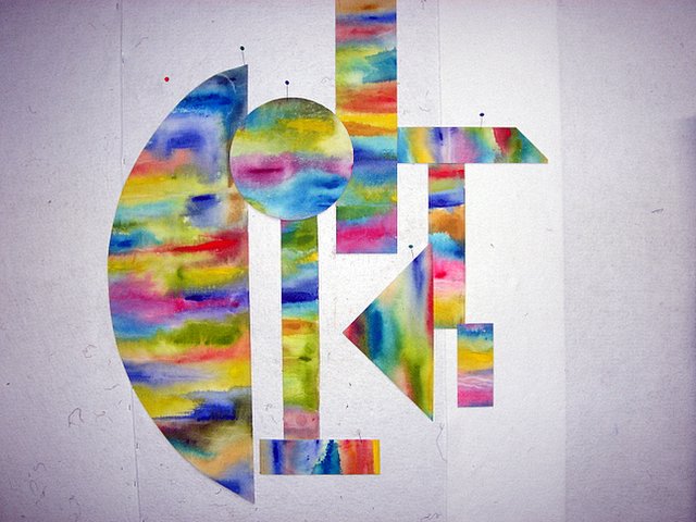
 Changed the orientation, went back to the original line work, fused the circle and now feel as if it's getting closer. However, I think it needs another smaller circle in the bottom right to balance the weight of the top left circle.
Promise you won' have to put up with this process again until all is resolved...but honestly, it looks better this way to me.
Egads, the first view could have been the best. Oh well, just leaves more pieces for another construction. Need to look at it for awhile before making another change. Comments appreciated.


7 comments:
Gabrielle,
I was very glad to see you are back on your blog. I missed reading it but also could relate to all the crap we fight in our brains. Now, I have to go and read it!!!
So glad you are back. I'm enjoying watching the re-alignments on this piece. Must admit there is something about that large half-sphere that simply confuses me. Adding the circle helped a bit.. but not enough.
That sphere is so visually heavy it seems to stop the eye instead of moving it through the composition.
Love, love, love the colours! For me the semi circle is too big but I go with your idea of a small circle in the bottom right to balance. So glad you are back and I've got something to read/look at!
Here is what I need you to do for me! Go to your blog settings and change your commetns to a pop up window. that way I can see what I am commenting on because I have a short memory! Ha! I love the colors and I like the new orientation better, but you do need to balance the large sphere somehow.
I agree with you about needing a 3rd round thing to balance out the design but not sure if about the size...what if you tried to reduce the size of the semi-circle like Val suggested????
Also, Gabrielle, the strip that has the slanted angle takes my eyes away from the piece.
I like it with the triangle on the bottom and half circle on top. A quarter turn of view #1. If you look at that composition maybe the placement of the circles will work?
Post a Comment